

Next
The book was the product.
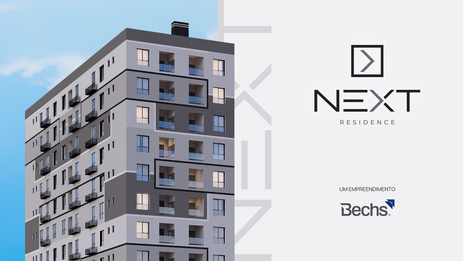
Next Residence is a residential tower by Bechs Construtora. It launched before construction began, with no sales stand and no model unit. Brokers had one sales tool: the book.
01
The brief
Nothing to show yet
Bechs needed a name and a brand for a new tower, and everything around the launch: website, social media, event materials and a presentation book for brokers.
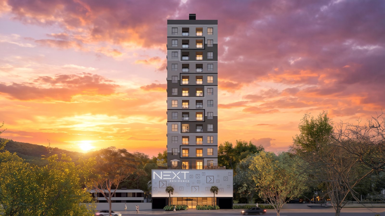
The launch came at the foundation stage. No sales stand, no decorated unit, and the scale model wasn’t finished until after the launch period. Buyers would decide on an apartment they couldn’t visit.
02
The name
Next, as in close
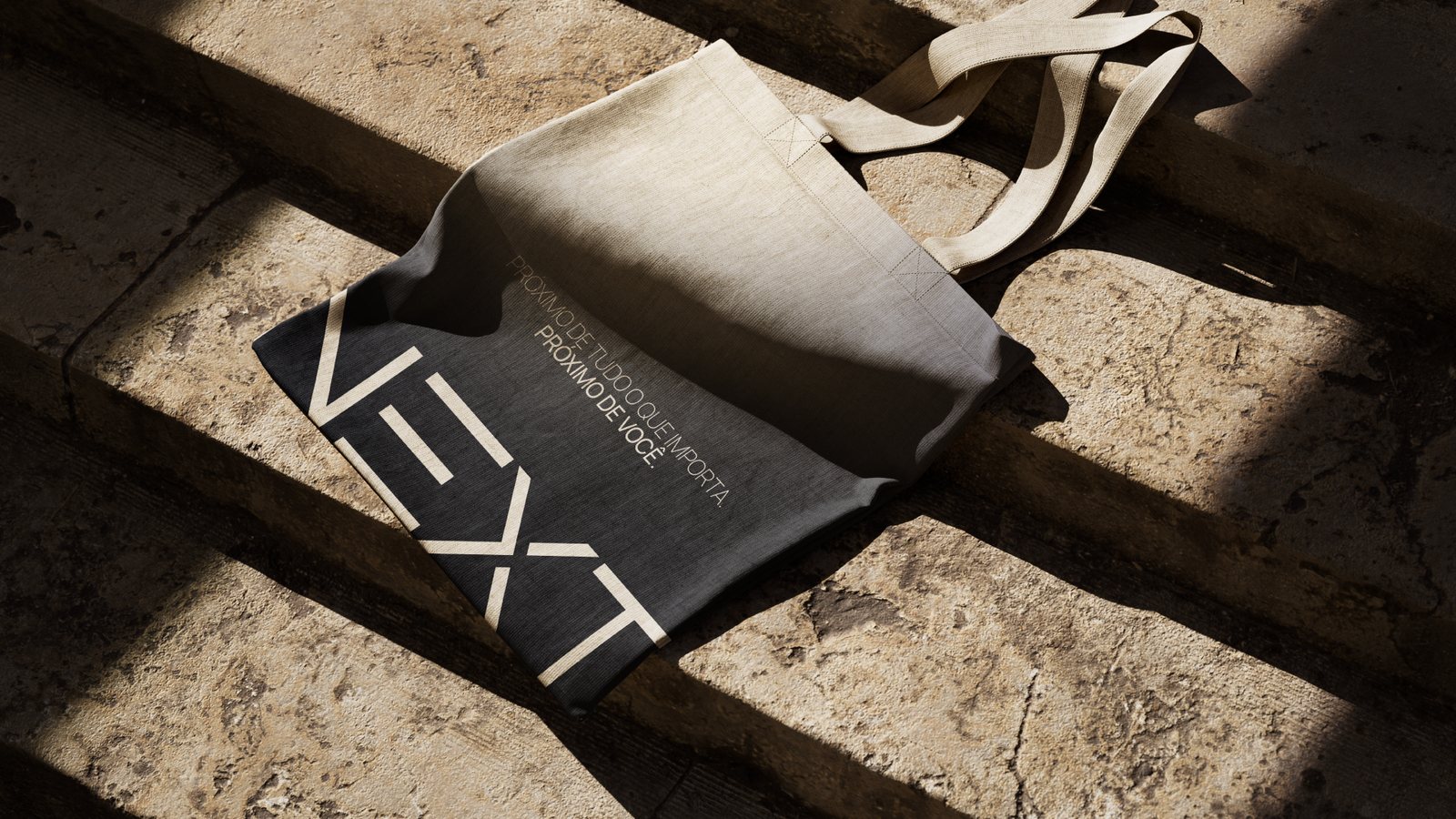
“Next” works in two directions. It means close: the building is minutes from what daily life needs. It also means the next step: a first home, a move up, an investment.
The Portuguese line carries both.

03
The symbol
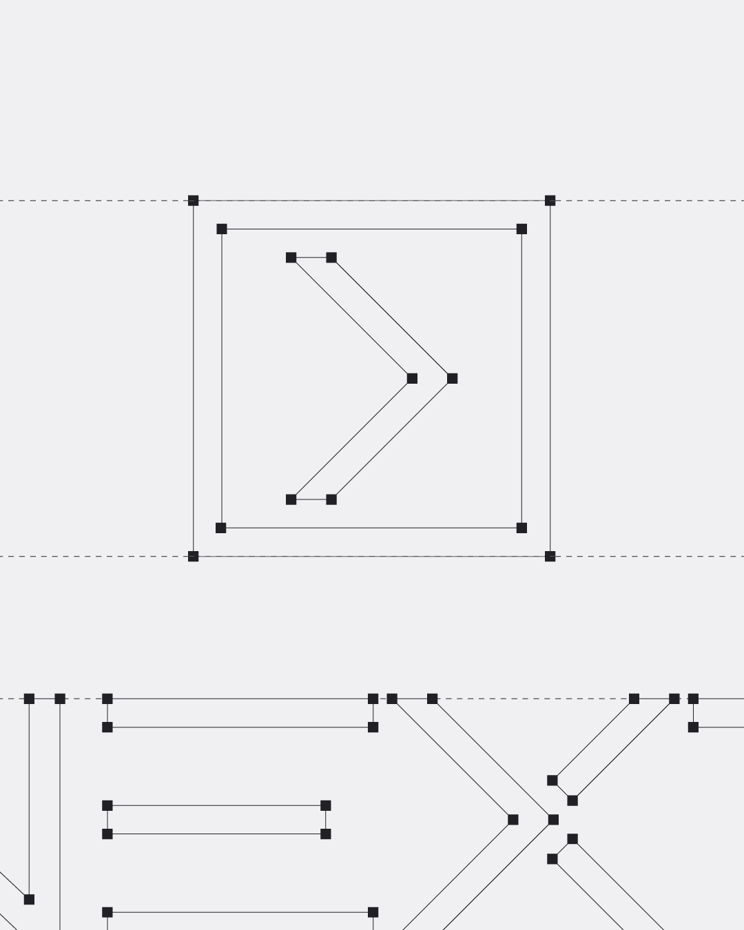
A step forward, inside a frame
A square with a forward chevron: the plot, and the move into it. The same angles cut the N, E and X of the wordmark.

04
The book
The apartment, on paper
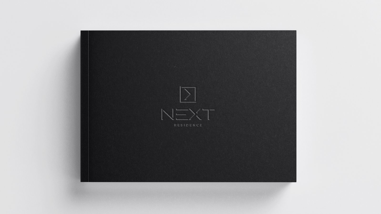
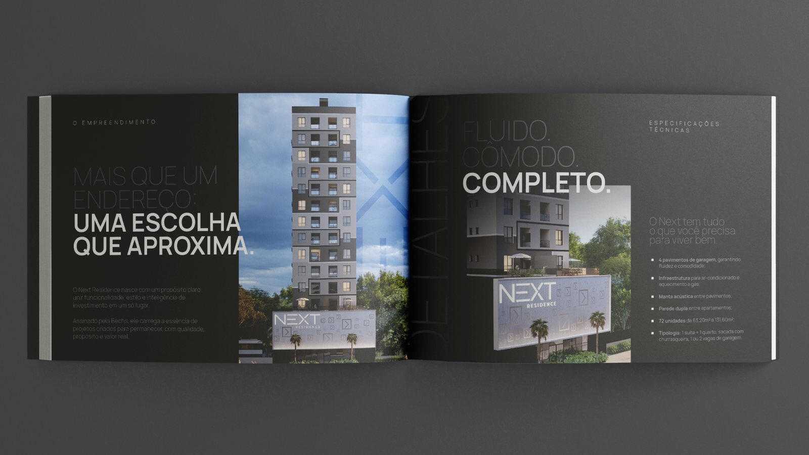
With nothing built, the book had to stand in for the model unit. It walks the buyer through the building: the facade, the location, the shared spaces, the interiors, and a floor plan for each unit type.
05
The launch
The same idea everywhere
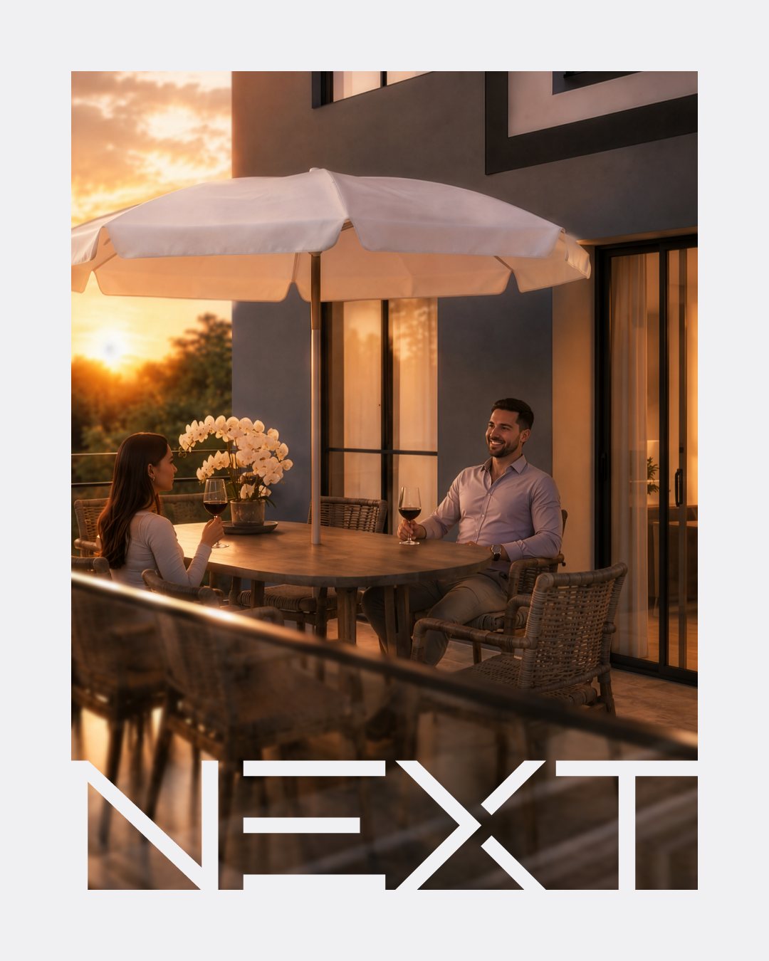
The billboard, website, social posts and the sign at the site repeat the book’s message: close to everything, and the next step.



06
The result
Sold from the book
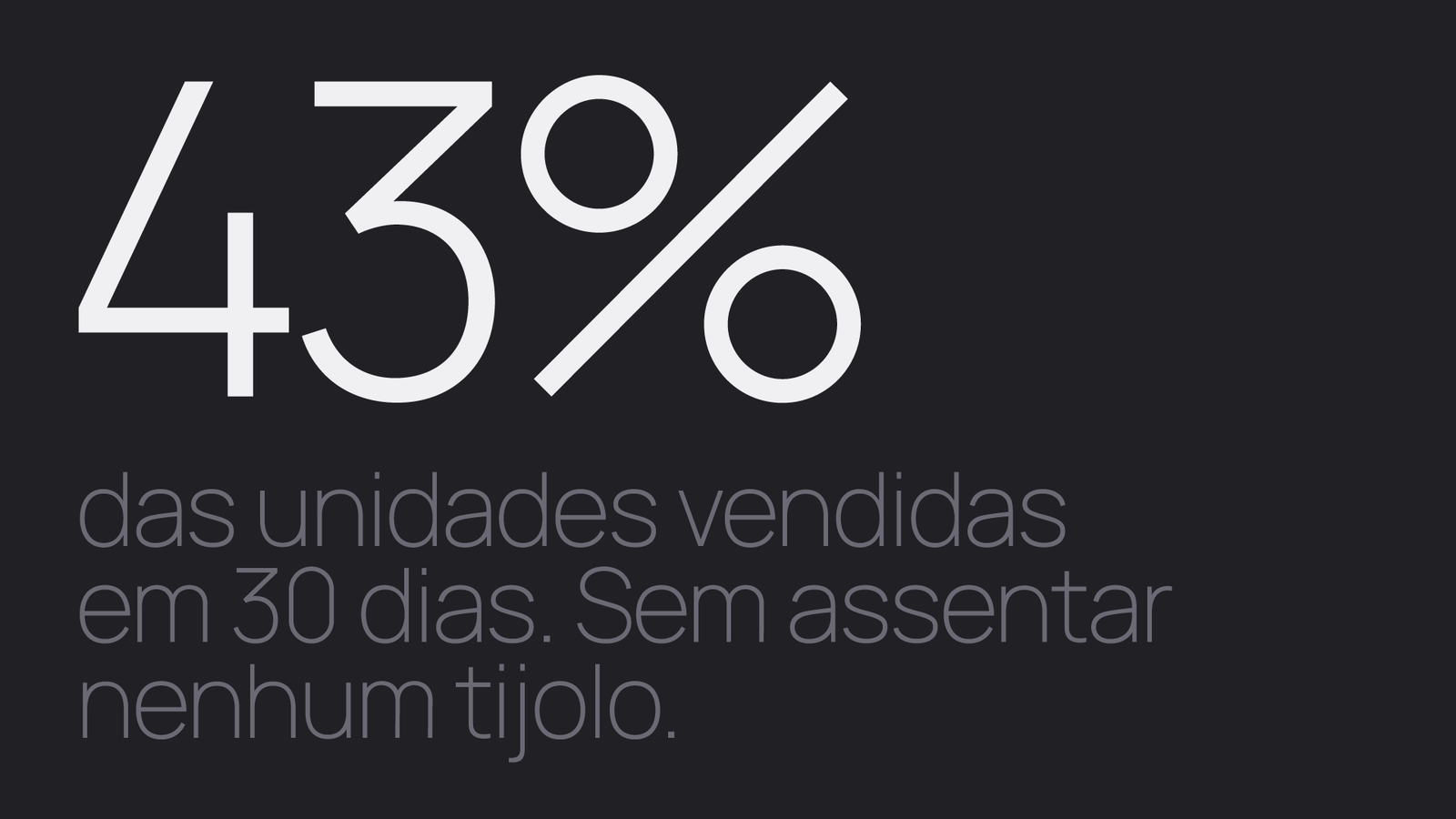
The launch ran for 30 days at the foundation stage. Brokers had the book and a price table.
In short
Before construction, there’s no apartment to show.
The book has to show it.
Credits
Developed at my studio, Truworks. Renders supplied by Bechs.
Next case
Dullius →