
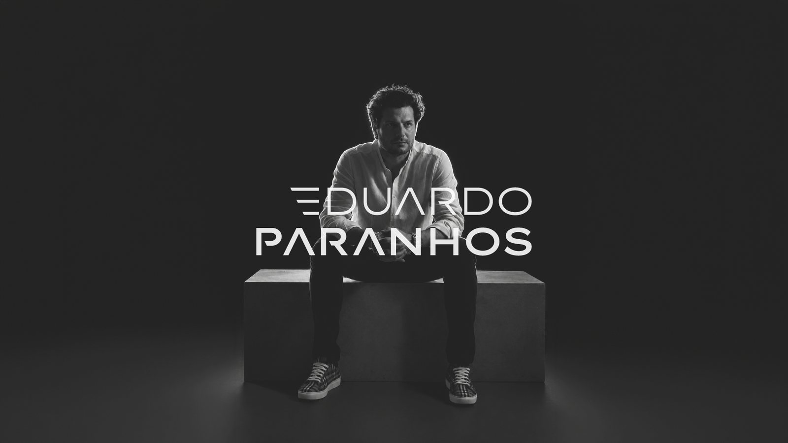
Eduardo Paranhos
Architecture, signed.
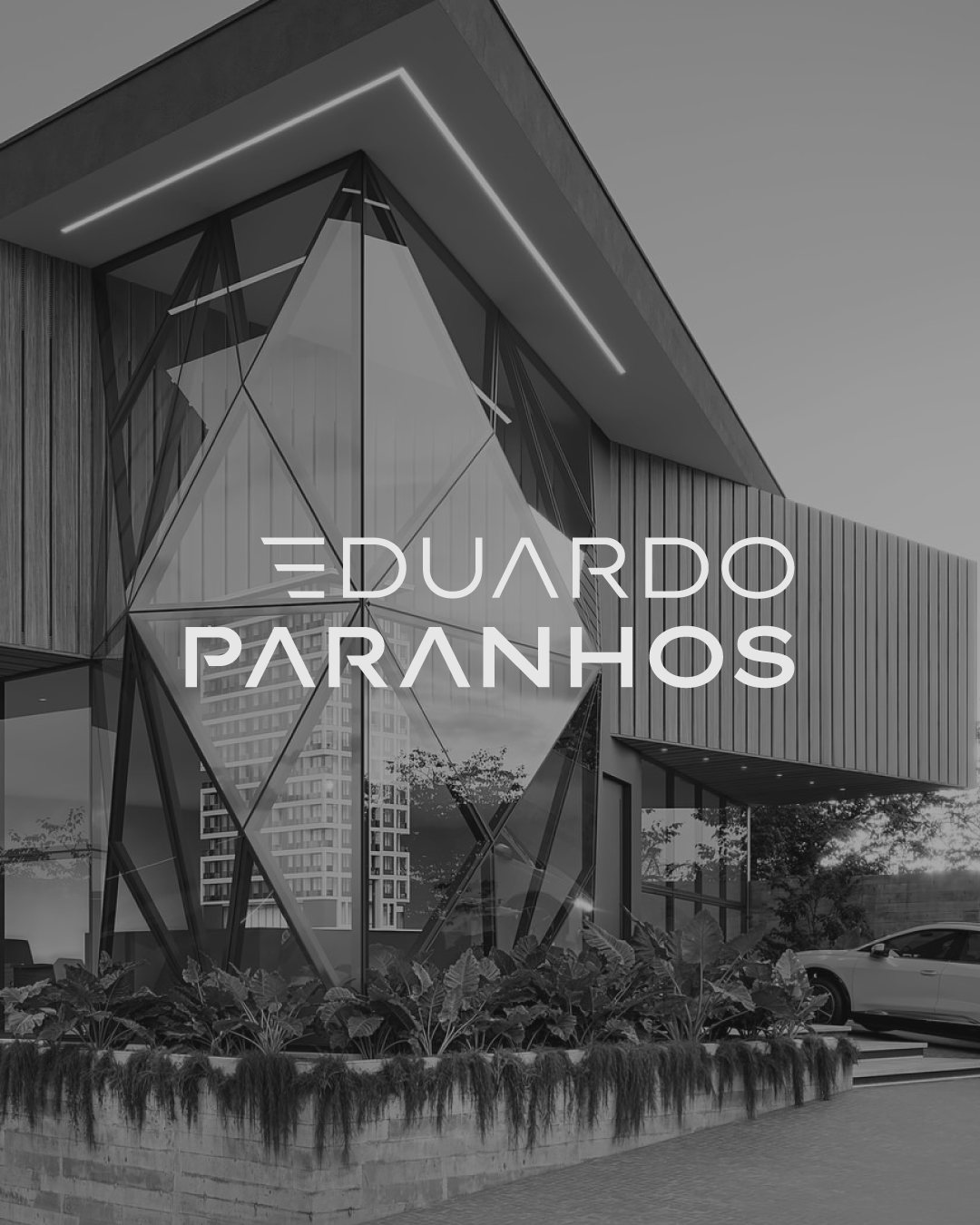
Eduardo Paranhos was already a high-end architect, but his mark didn’t show it, and it couldn’t even be painted on his own sites. The rebrand kept his monogram, rebuilt it to work on site, and added something only he could give it: his signature.
01
The brief
High-end work, a mark that didn’t match
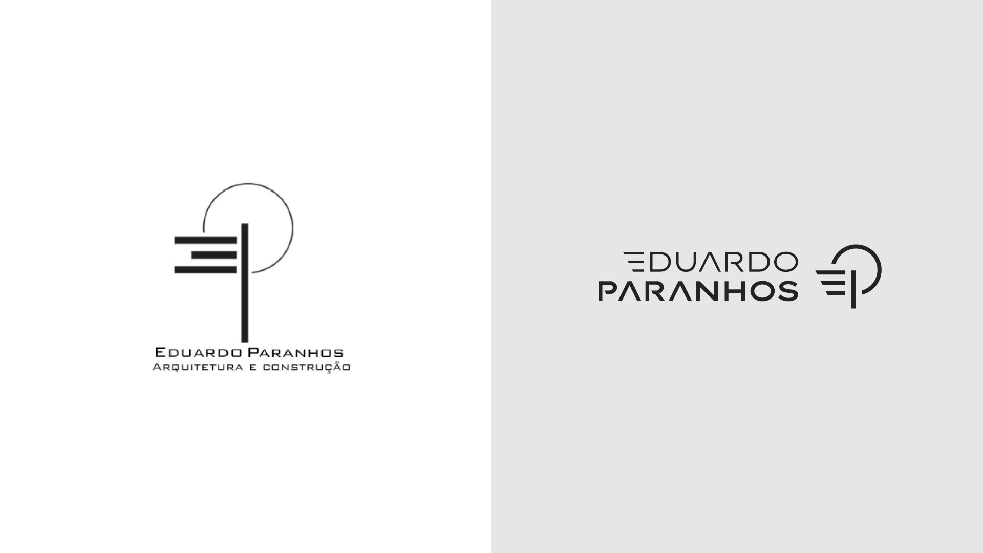
Eduardo designs and builds high-end homes. His old mark failed in two ways: it didn’t look like his work, and it couldn’t be built. On site, painters couldn’t reproduce it by hand, and its hairline arc didn’t survive laser cutting.
02
The symbol
Five parts, one weight
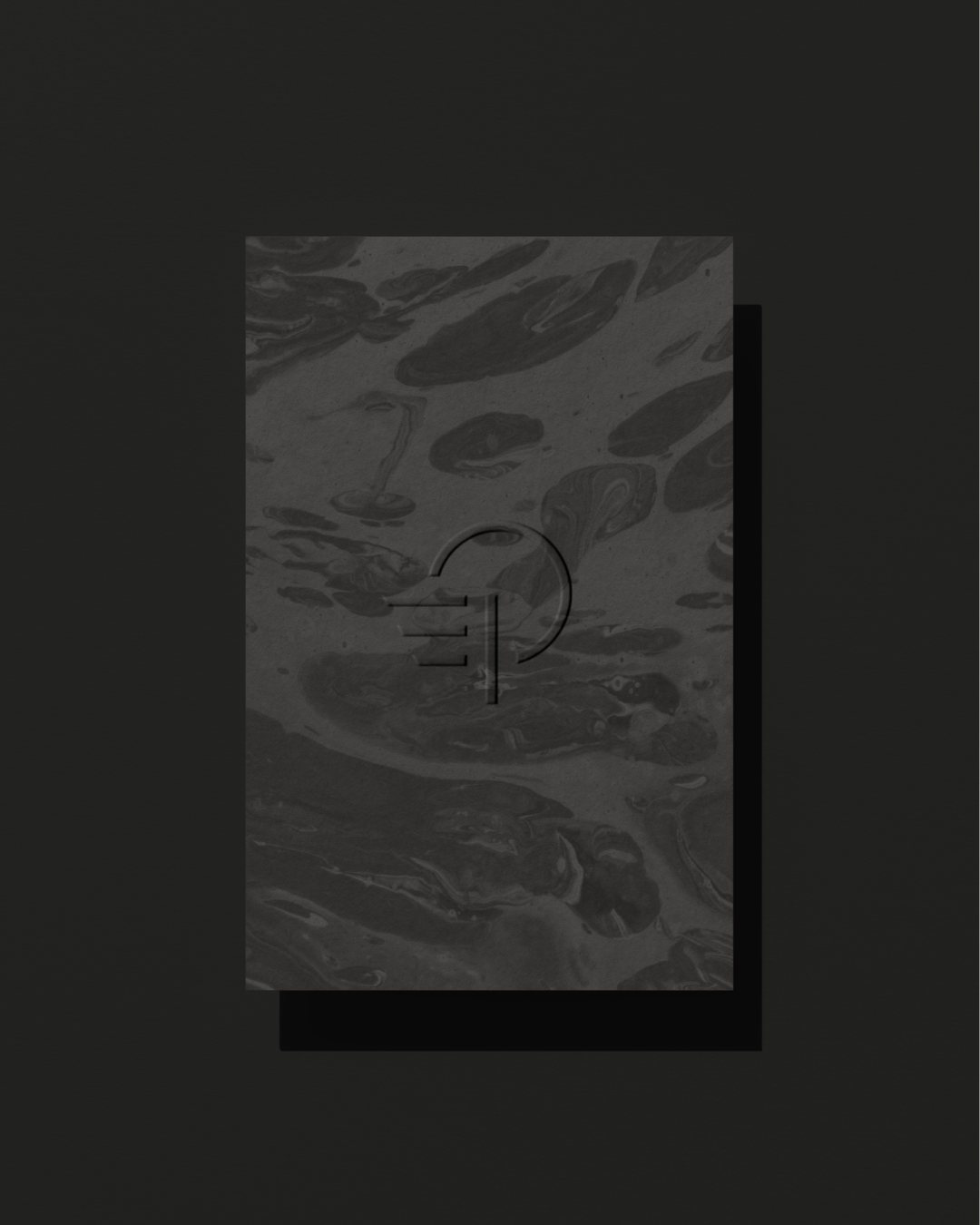
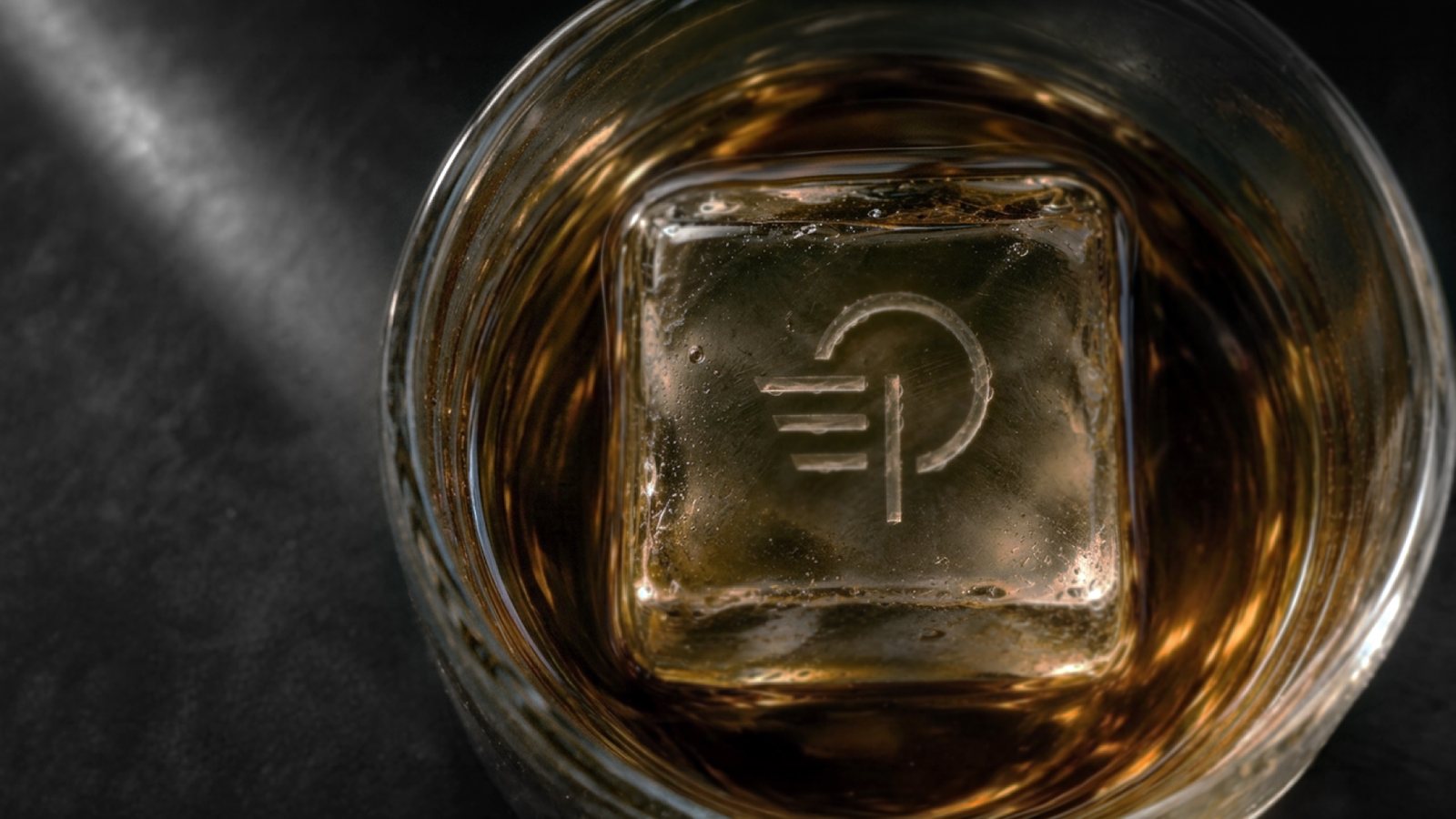
The EP monogram was already his, so I kept it and rebuilt it. The arc now has the same weight as the bars and the stem. The gaps between the five parts are deliberate: they work like a stencil, so the mark can be spray-painted on a hoarding or cut from sheet metal.
03
The wordmark
The E comes from the symbol
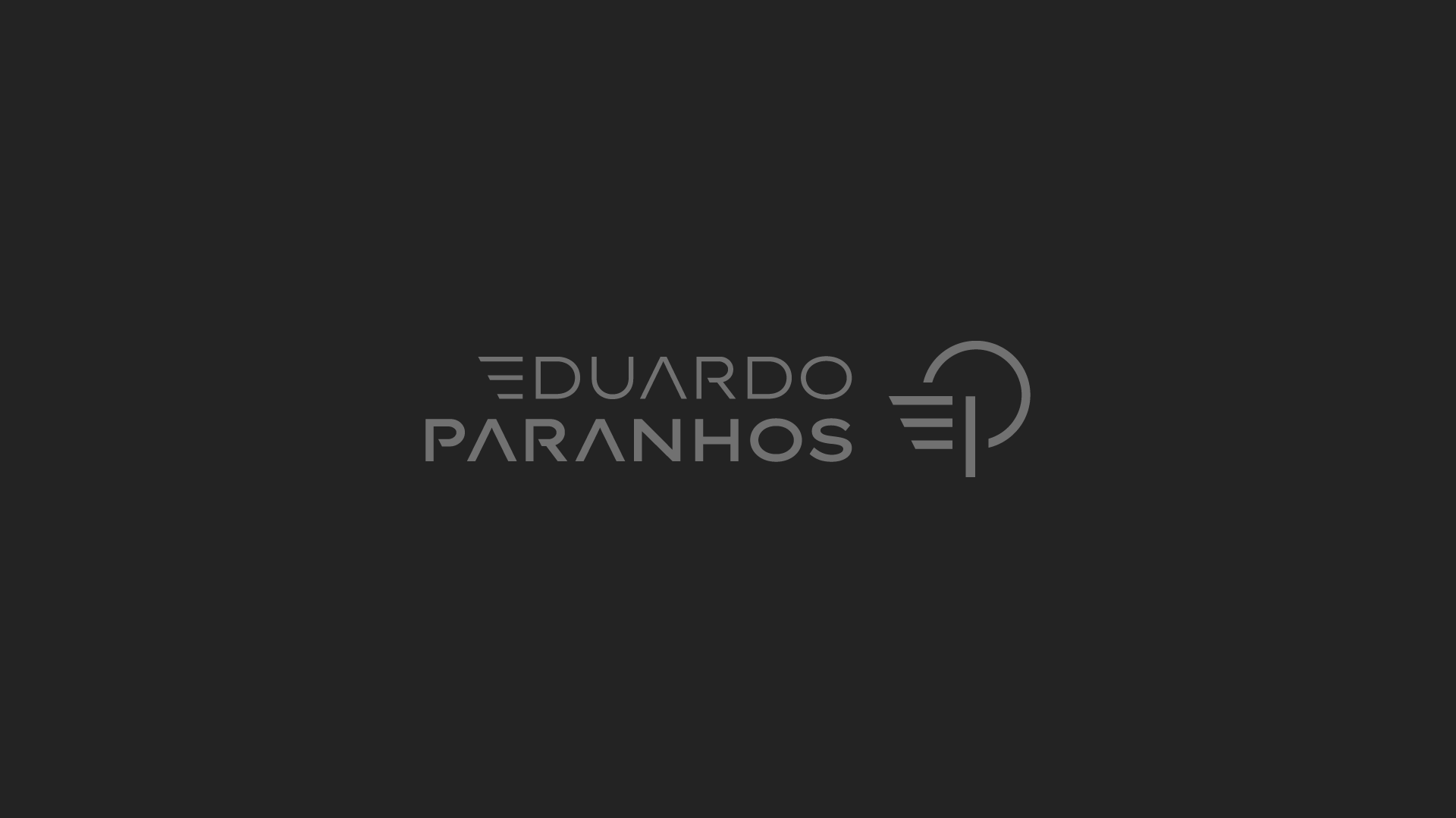
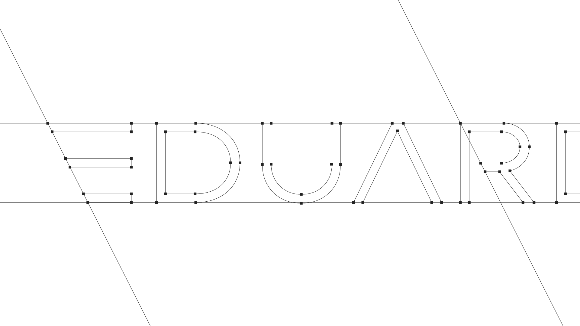
EDUARDO in light, PARANHOS in bold. The E has no stem. It’s the symbol’s three bars, cut on one diagonal, so the name and the mark are built from the same parts.
04
The signature
The architect signs his work
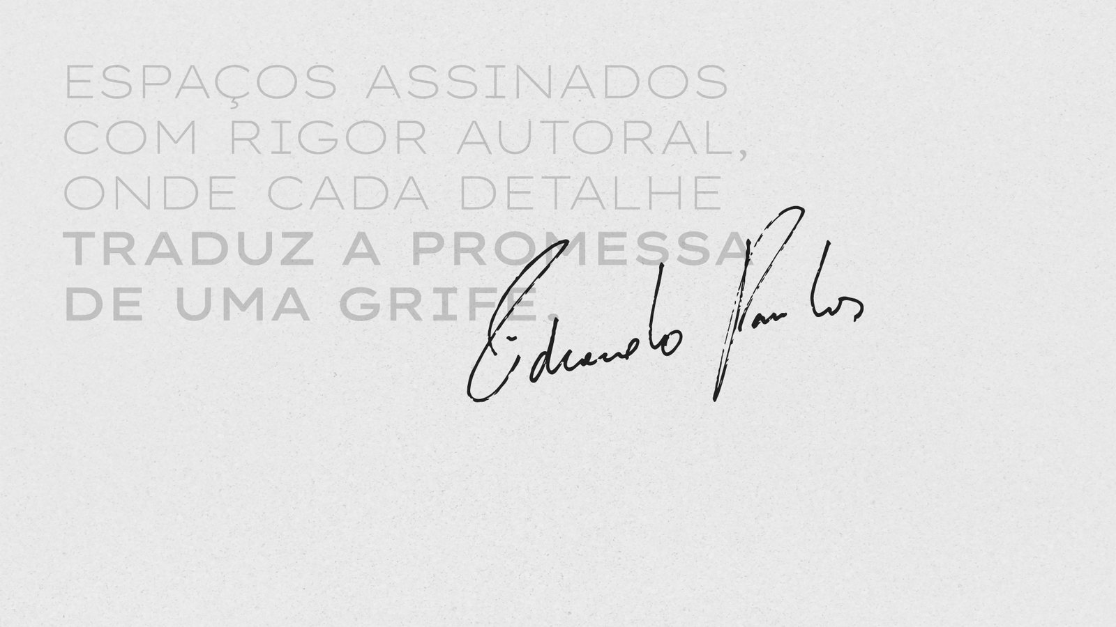
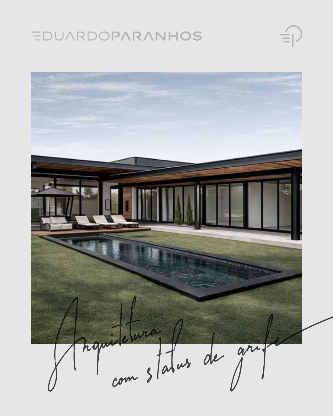
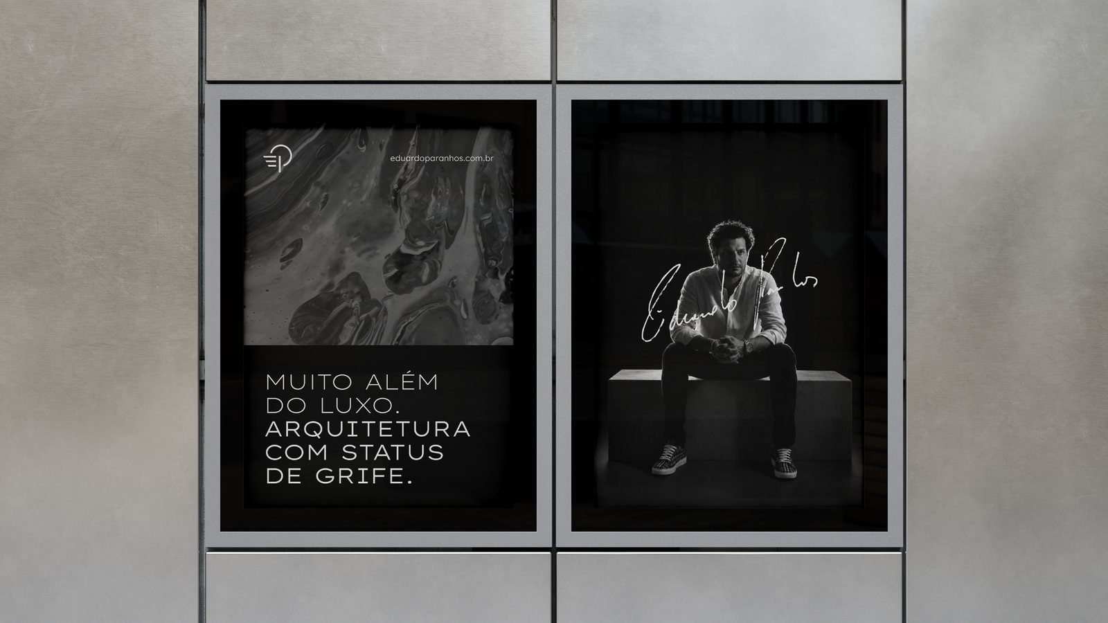
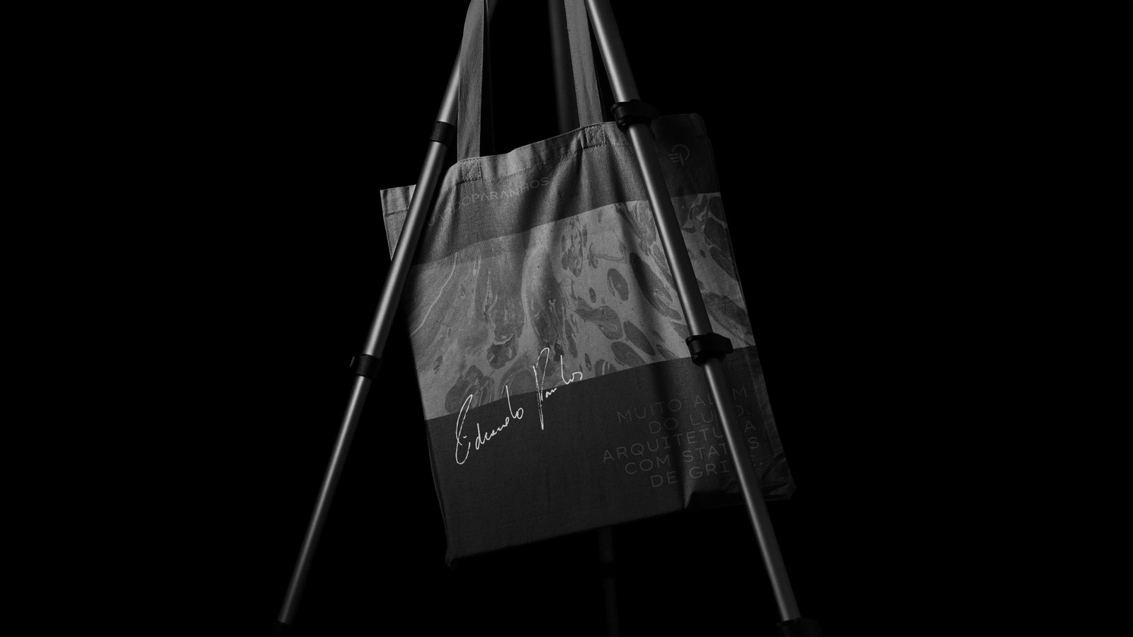
The goal was for people to recognize Eduardo’s houses by their author, the way you recognize a designer label. So the identity carries his real handwritten signature. In Dullius, the script speaks to the buyer. Here it comes from the author.
05
The texture
No two pours alike
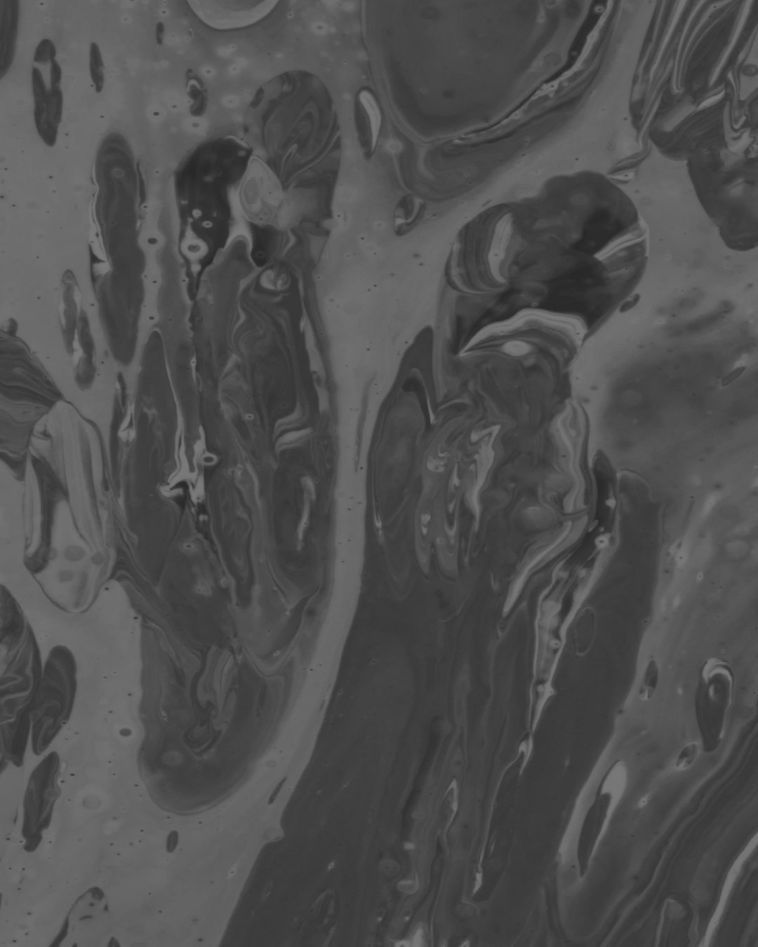
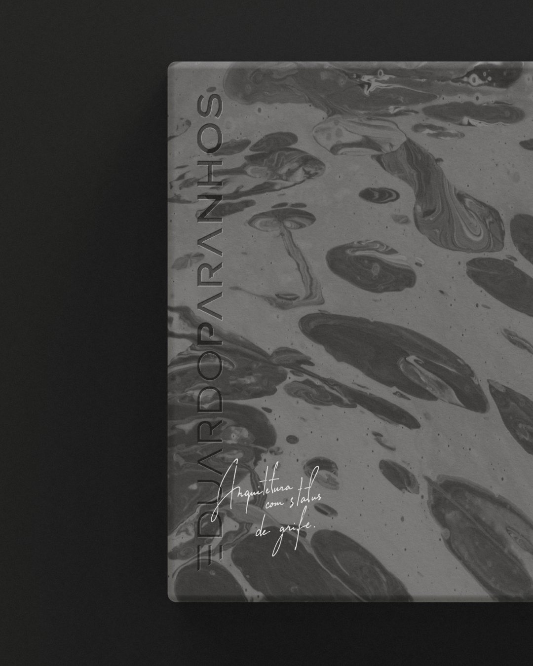
The texture comes from paint dropped on water. The pattern forms on its own and never comes out the same way twice. It stands for what Eduardo offers: work made once, for one client. It runs across cards, packaging and print.
06
Applications
Signed, everywhere
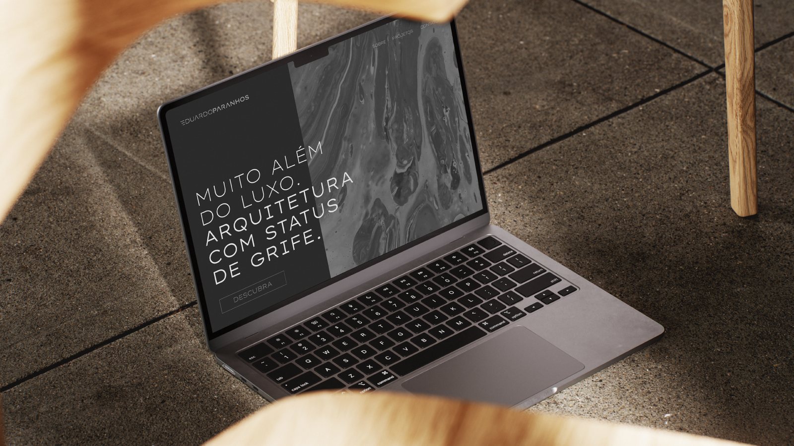
The same parts on posters, a website, a tote bag, even an ice cube: the symbol is simple enough to be cut into almost anything.
In short
A logo marks the work.
A signature claims it.
Credits
Developed at my studio, Truworks.
Next case
Next →