

Exnor Group
Room to grow.
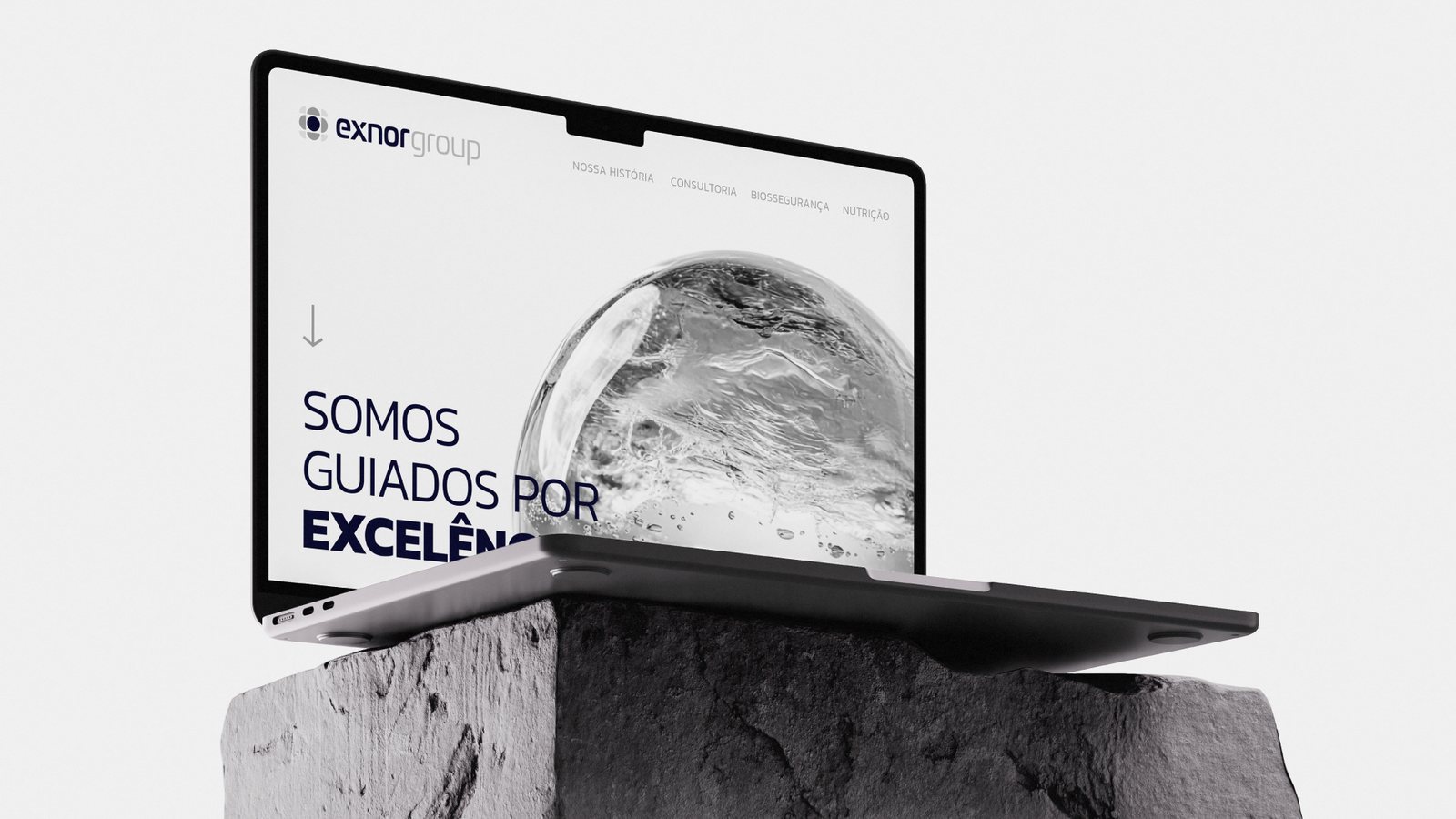
Rodrigo left a large regional agribusiness to work on his own as a nutrition consultant for pig farms. He had one service and a plan for more. The brand was built for the company he wanted, not just the one he had.
01
The brief
One service, a bigger plan
After years at a large regional agribusiness, Rodrigo went independent as an animal nutrition consultant, advising pig farms. He started with one service. In our discovery session, he talked about what could come next: biosecurity products and, one day, feed.
02
The insight
Build the structure first
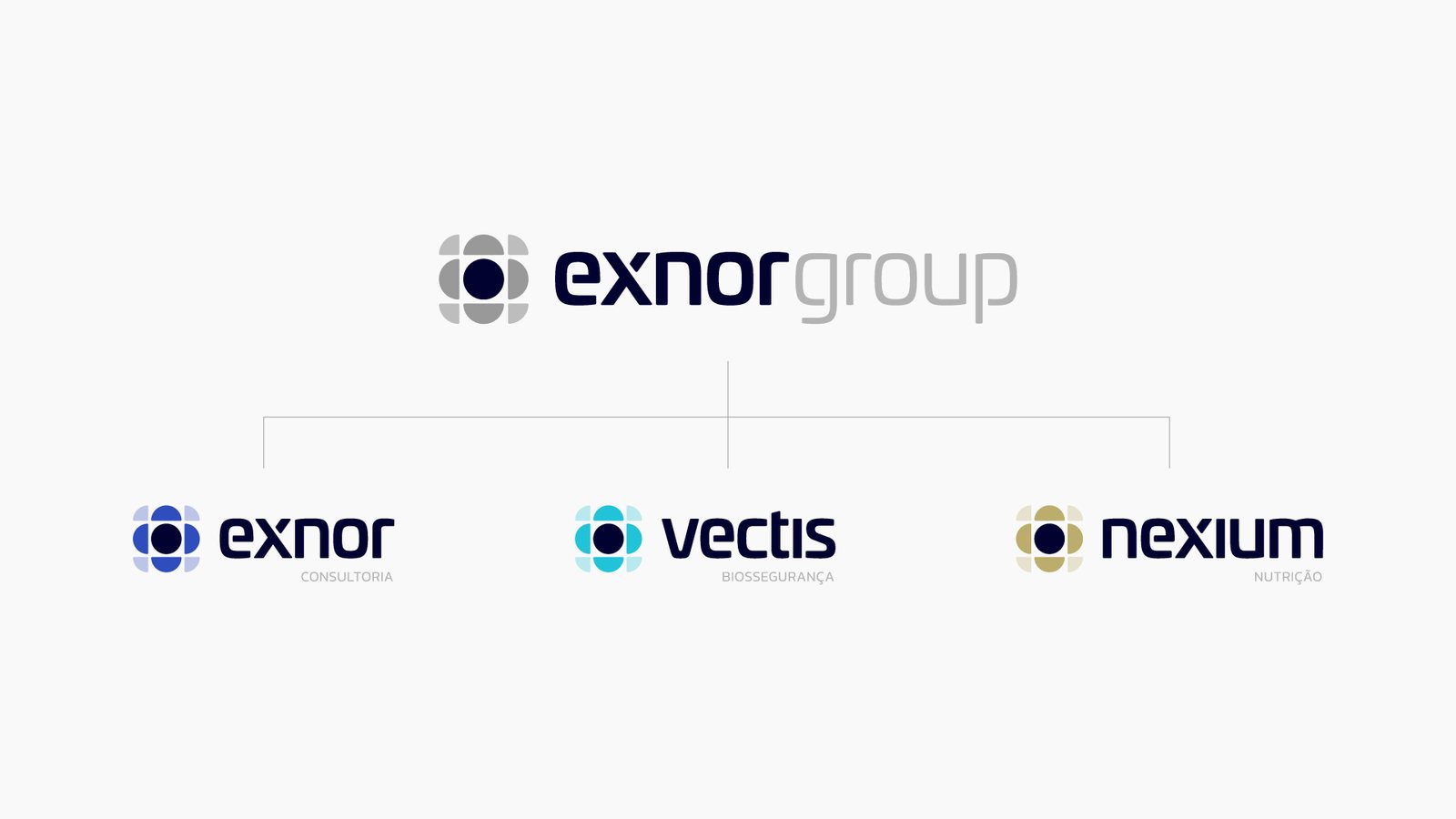
Most new businesses get a brand for what they are today and rebrand when they grow. Rodrigo’s plans were clear enough to name. So instead of one brand, we designed a structure: a parent company with a place for each business he described, while only one of them existed.
03
The architecture
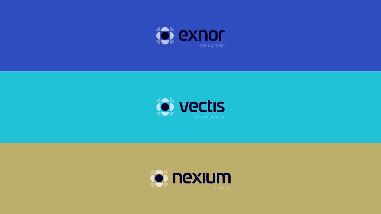
A parent and three units
- ExnorConsulting
- VectisBiosecurity
- NexiumNutrition
Each unit speaks to its own market under its own name. “A brand of Exnor Group” ties them back to the parent.
04
The symbol
A core and what grows from it
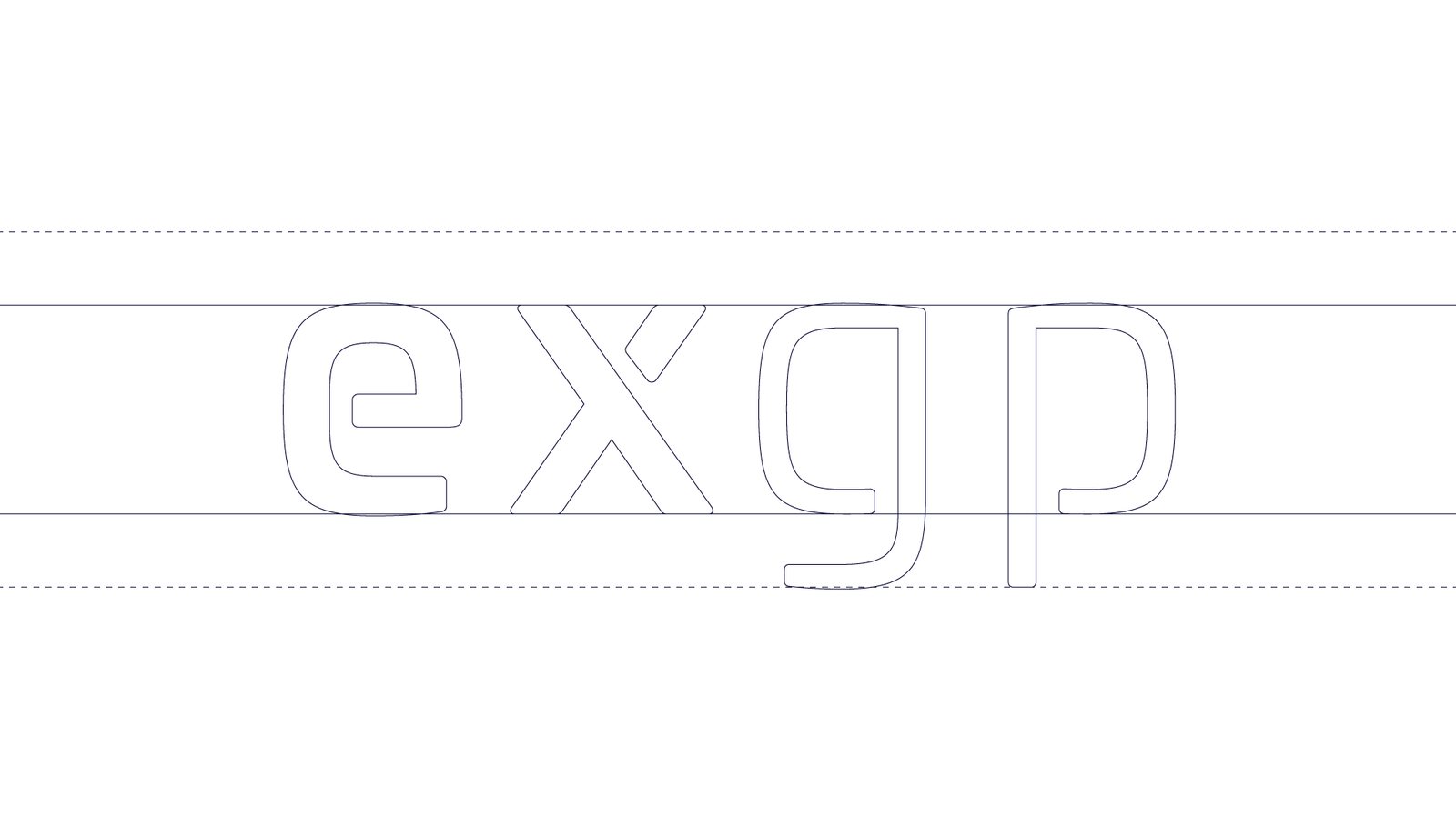
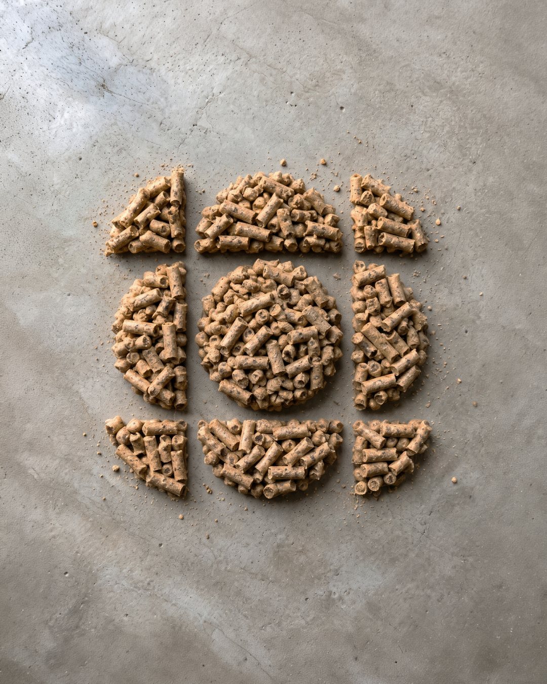
A core with four parts around it. The center is the base of the business, Rodrigo’s technical knowledge. The parts around it are the solutions that grow from that base. The wordmark is drawn on the same geometry, for a sense of precision.


05
Color as architecture
Same shape, new color
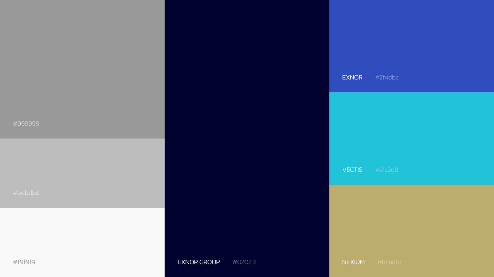
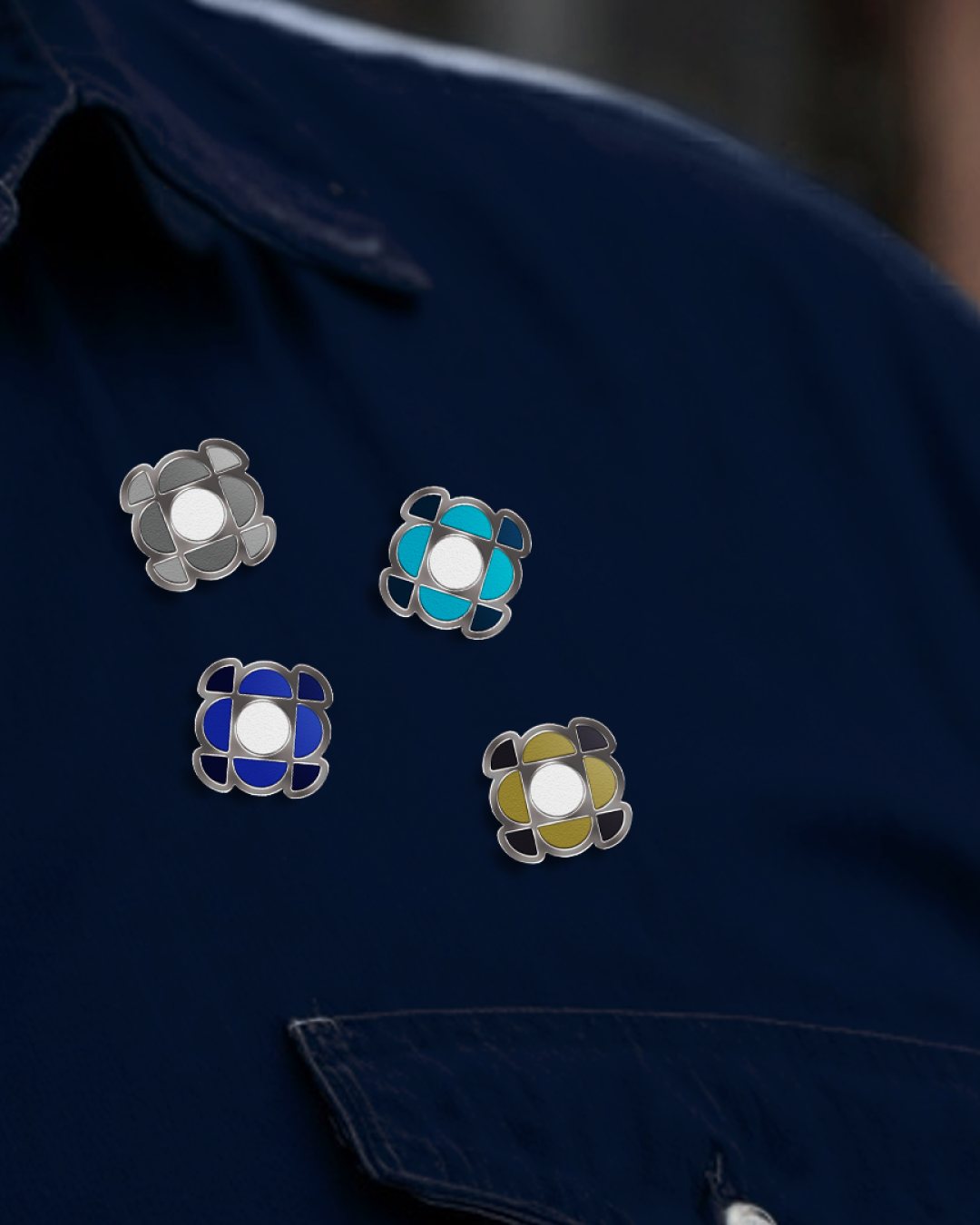
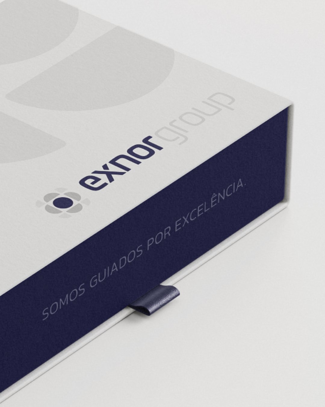
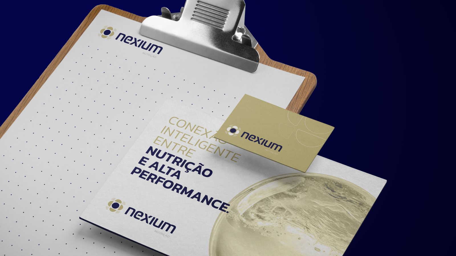
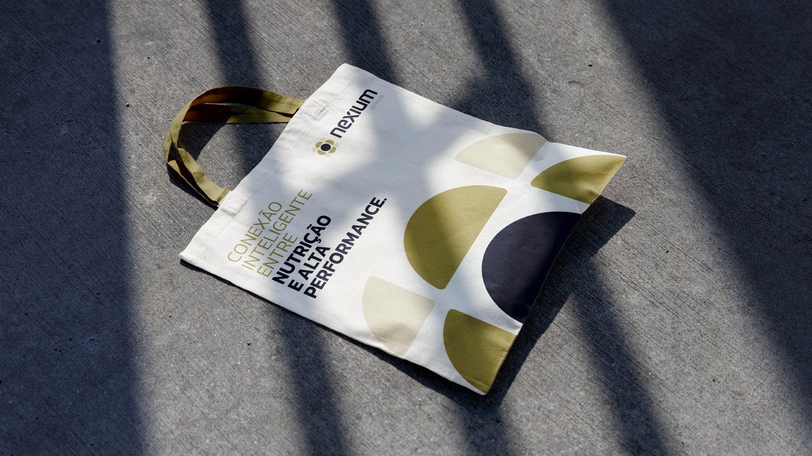
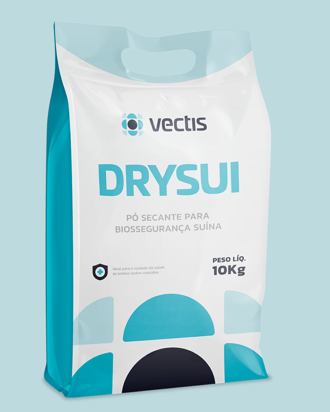
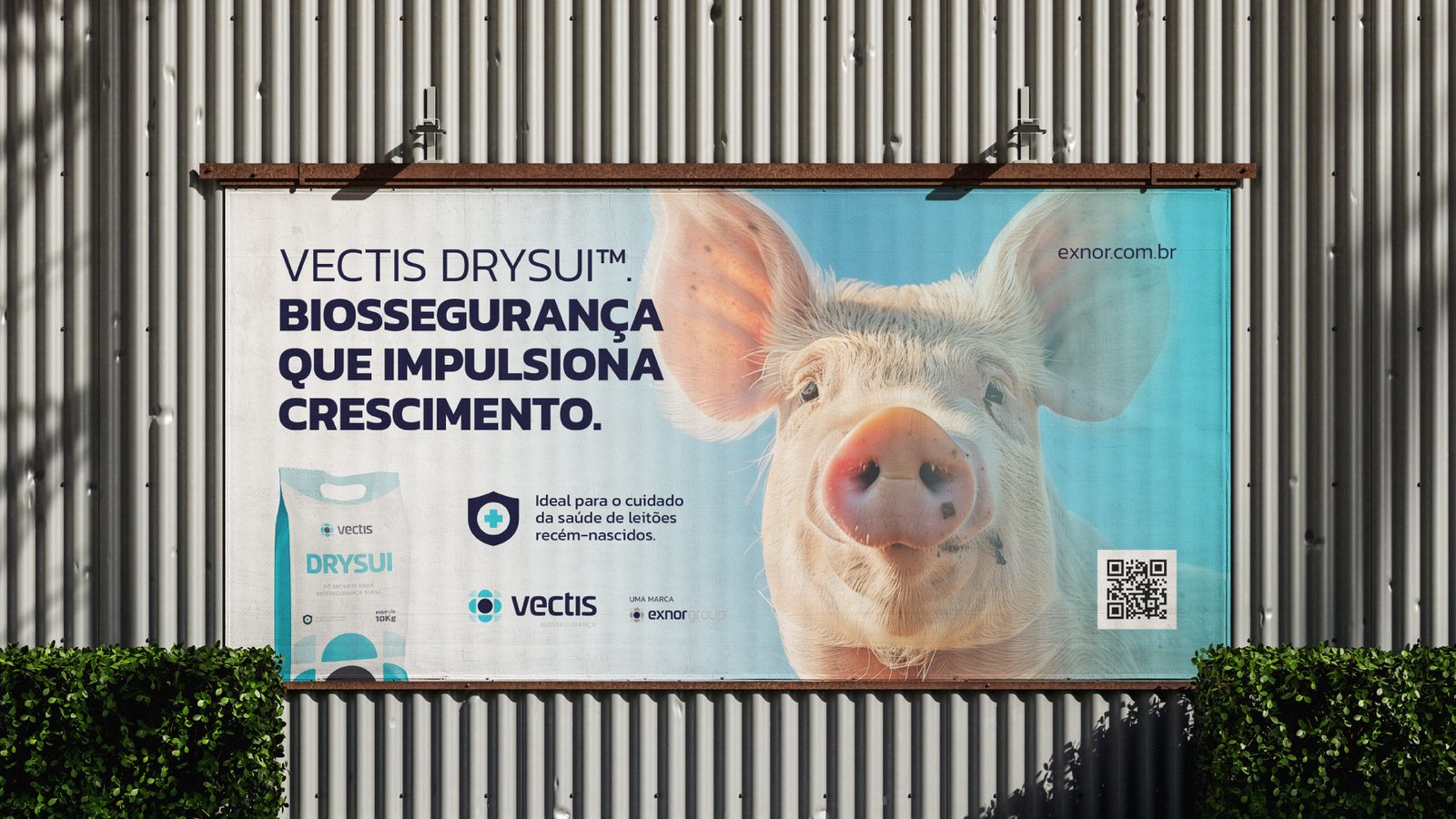
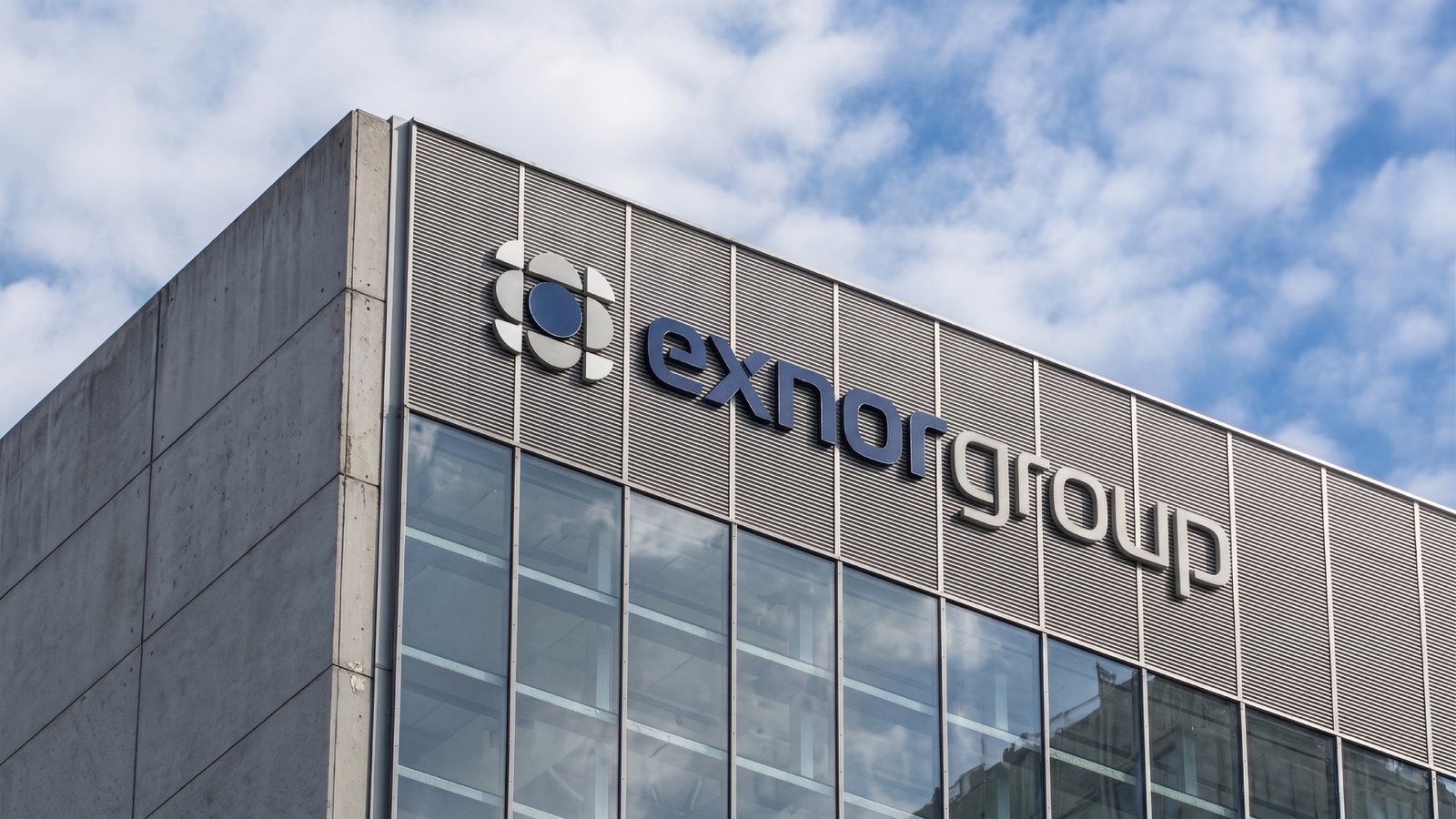
Every brand in the group uses the same symbol. Only the color changes: navy and gray for the group, blue for consulting, cyan for biosecurity, gold for nutrition. A new business doesn’t need a new identity, just a new color.
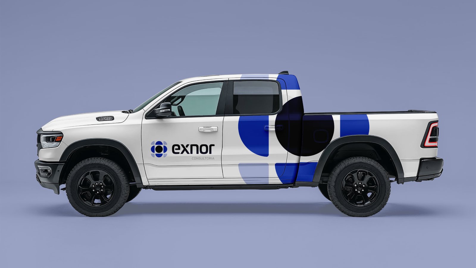
The symbol’s parts also work on their own, as large shapes across vehicles, packaging and print.
06
The system in use
Three units, one family
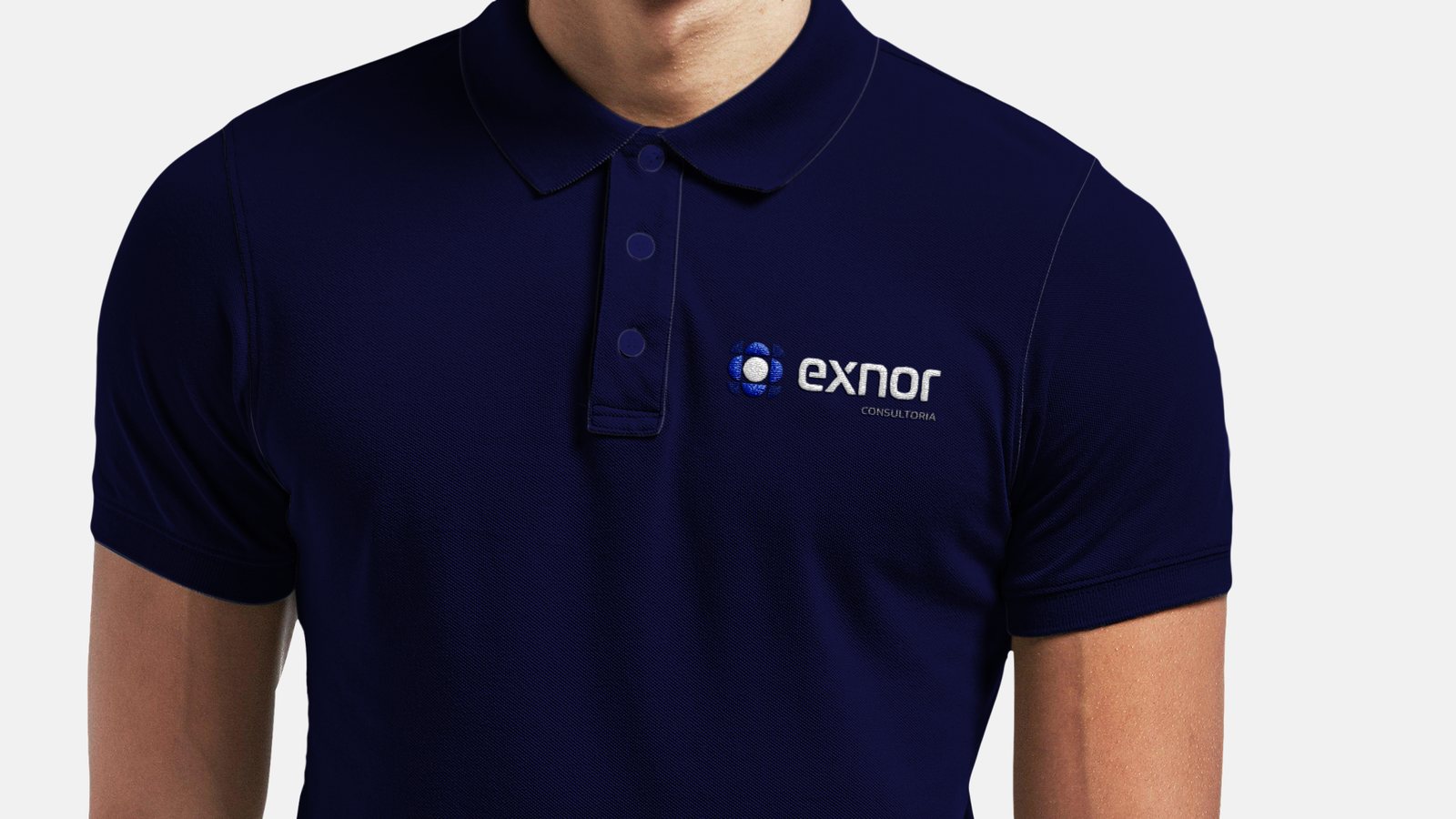
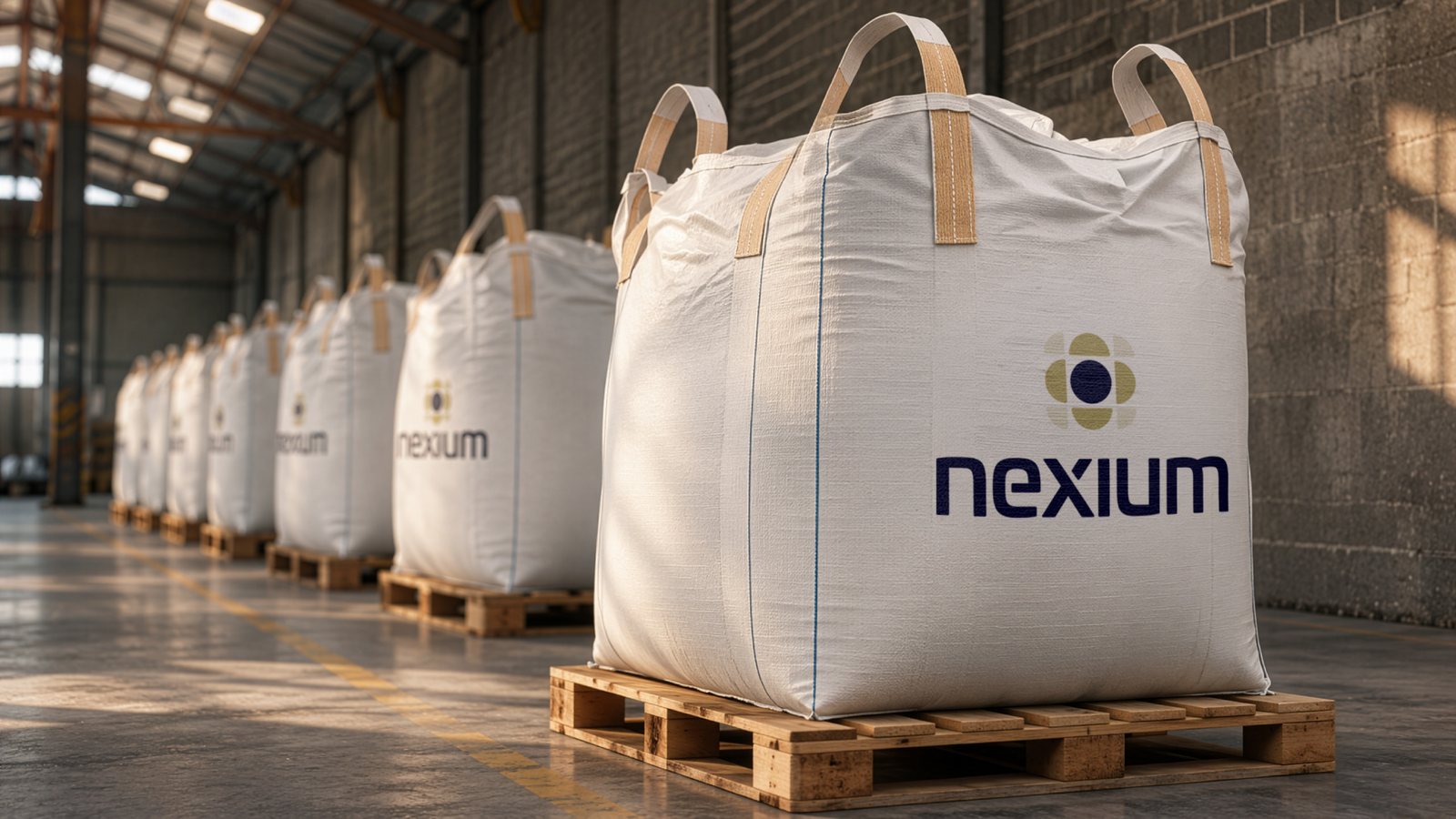
The group on signage. Exnor on vehicles and uniforms. Vectis on packaging and outdoor media. Nexium on feed bags, stationery and print.
07
What happened next
From a plan to three plants
When we started, Nexium was a plan. Since launch, Rodrigo has moved from advising on feed to producing it: Nexium now runs three feed plants and has become the group’s main business, under the name and place it was given on day one.
In short
One business needs a logo.
A growing one needs a structure.
Credits
Developed at my studio, Truworks.
Next case
Eduardo Paranhos →